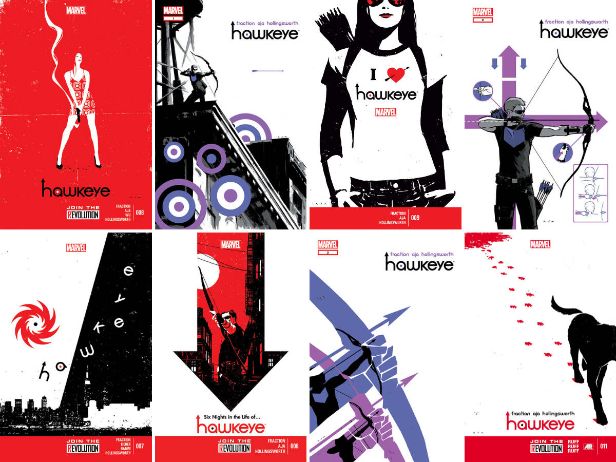
The recent Hawkeye television series on Disney+ (which I will discuss in another post) was clearly based on the comic book run by Matt Fraction and David Aja (with Matt Hollingsworth on colours and Chris Eliopoulos on letters, edited by Steve Wacker), with the visual aesthetic of the promotional material stealing the brilliant design work by Aja on the covers (without paying or even mentioning Aja, which is ridiculous, offensive and insulting; but that’s a diatribe for another time). I thought I’d revisit the comic books (or, in my case, the trade paperbacks I bought at the time because the price of monthly books had become too high for my bank balance) because I didn’t write about my enjoyment of them at the time. Ideally, I should have written this before the series, if I were a timely blogger who pays attention to schedules and keeps deadlines, but what’re you gonna do?
The first point to mention that, although it’s remembered as the Fraction/Aja run, the art for the series was not exclusively by Aja. Other talented artists drew issues: Javier Pulido (#4 and #5 and Annual #1), Steve Lieber and Jesse Hamm (#7), Francesco Francavilla (#10 and #12), Chris Eliopoulos (#17) and Annie Wu (internal romance covers for #8 and the Kate Bishop solo story in #14, #16, #18, #20). This means that Aja actually drew only half the issues (approximately); however, his unifying covers, design work, general aesthetic and moody artwork set the tone and consistency for the book that defined the title, apart from being the artist who drew it more than the other artists. Also, there’s the fact that his art is amazing …
Before this post becomes a hagiography of Aja’s art (which it will), let’s start with some basics. This series came out in 2012, part of the Marvel Now reboot-but-not-a-reboot. It is very specifically about what Clint Barton aka Hawkeye does when he’s not in the Avengers as well as dealing with his various issues (his inability to accept help, his broken relationships, his not thinking things through). In this, he his helped by Kate Bishop aka Hawkeye, who arrives in issue #2 and gets to have her own adventure later in the series. The book as a whole is a wonderfully entertaining series, digging into Clint’s psyche, developing Kate, introducing ideas and characters that would be used wholesale for the Disney+ series (Lucky the Pizza Dog, the Tracksuit Bros, the car chase), mixing great action with character moments and hilarious dialogue.
The first issue starts as it means to go on, with Hawkeye falling out of a window while firing a grapple arrow with the caption: ‘Okay. This looks bad.’ We are shown that in his downtime, Clint lives in the top floor of a building in Bed-Stuy – Fraction has a lot of fun playing with the comic book form, such as background dialogue that is represented as ‘(Some Spanish-sounding stuff!)’ and ‘(Russian maybe?)’ – fully aware of his place in the world, describing himself as ‘fighting with a stick and a string from the Paleolithic era. Paleolithic. I looked it up.’ It’s also the introduction of Lucky the Pizza Dog, who helps Clint but gets hurt so Clint saves him. Fraction has a good handle on what he wants to do with the story, and Aja has a great handle on what he wants to do with the art to complement the story. He uses the technique of smaller panels within panels to highlight important parts of the scene, with beautiful panel design that uses the grid format but also plays with it as he leads you through the pages (he does have a Master’s degree in Fine Arts [Design and Audiovisuals] and it shows).
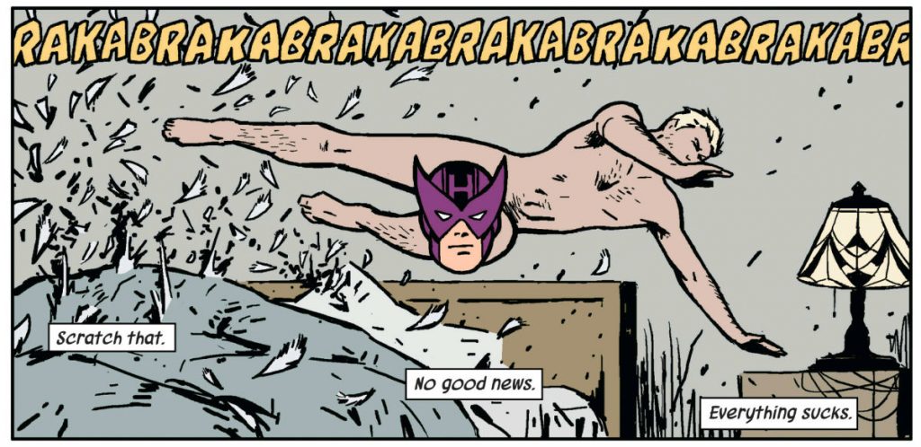
Aja’s talent for storytelling and design is throughout the book, from the covers to the interiors, and it’s a joy to the eyes. The second issue has a page that is a phone call between Clint and Kate, in which Clint asks her to work with him – it’s a masterclass in design and use of panels to tell the story, with each a different facial expression to convey the emotion of the scene, and with the panels as a waterfall between two larger panels to Clint and Kate at their respective phones. And that’s just a talking scene. In issue #3, we have the car chase scene (the Tracksuit Mafia chasing Clint and Kate in a car stolen by a woman that Clint has just slept with) that is a dazzling orchestration of action and camera placement. It’s also the issue in which we have the infamous panel of a naked Clint jumping across the panel, with a Hawkeye mask face covering his modesty:
It’s not just the Aja show – Fraction is an equal participant, setting up story beats that will pay off further down the line while giving you all the action you want and the funny lines (‘Putty arrow, bro!’, ‘(Derogatory patriarchal epithet)’, ‘I geev you Avenger (slang for male genitalia)’). The fourth and fifth issues highlight this due to Javier Pulido coming on board for art duties for a story about a missing videotape being auctioned to big villains in Madripoor that indicates Clint’s hero attitude but also sets up Madame Masque as a problem for Kate later in the series. Pulido is a talented artist who does a great job here, but Aja has put such a definitive stamp on the book that it’s hard to accept another interpretation.
An aside: the final three trade paperbacks order the issues differently to how they appeared originally: the second trade starts with issue 7, before issue #6, and then returning to the sequence until issue #11; the third trade compiles Kate’s story into a single story, the individual issues of which alternated with Clint’s story, which is compiled in the final trade, starting with issue #17, before jumping back to issues #13 and #15, and then finishing the book in sequence from #19. It’s an interesting use of the trade collection, which I can’t recall being used much before, allowing for a more seamless reading experience (from both a character perspective and art perspective).
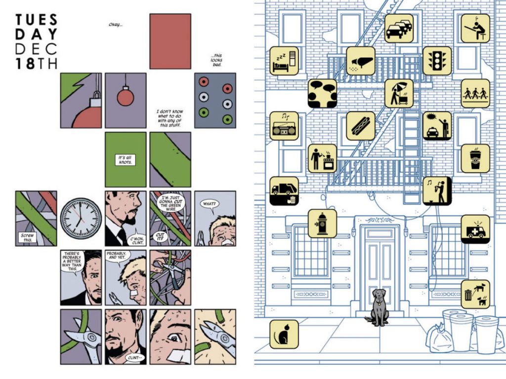
Issue #7 is ostensibly about a big storm affecting our heroes, but which will have an impact later in the series – I wonder what this series must have been like to read in the single-issue format and the month-to-month wait between them. The trade returns to issue #6 and Aja’s superb graphic design, from the opening page with a mix of small panels and empty space, to the subsequent pages with a huge panel and lots of small panels underneath or around the large panel, with his art style taking on a ‘graphic design’ sensibility in coordination. Plus ‘It’s (obscene gerund) snowing’, which is my favourite of Fraction’s playing with word balloons.
The second trade deals with Clint’s relationships, with appearances from his ex-wife Bobbi, Natasha Romanoff and Jessica Drew (a more recent relationship, I presume, from my limited knowledge of the character’s history), and an issue drawn by Francavilla (which you can’t call a fill-in). But it’s issue #11 that blows everything away with the story told entirely from the point of view of Lucky the Pizza Dog, and it’s an absolute delight. From the opening page in which we see graphical representations of how Lucky views Clint and Kate, to the minimal use of dialogue and the maximum use of iconography (the splash page of Lucky sitting in front of the building and smelling everything is fabulous), the whole issue is genius, so hats off to Fraction and Aja even more than I’ve already removed my headwear in appreciation.
The second trade has extra material in the form of Matt Hollingworth explaining the colour process for the book, explaining that ‘Hawkeye is colored with minimalism in mind’, which highlights the collaborative approach to comic books that simpletons like me can sometimes forget.
The third trade, LA Women, has the annual (with Pulido on art) and the adventures of Kate (and Lucky, because he left with her instead of staying with Clint) when she leaves the self-destruction of Clint in New York and travels to Los Angeles (Clint: ‘Great idea. Because the West Coast totally needs a Hawkeye.’) and tries to make it on her own and her father cuts off her credit cards (because he is a bad guy in league with the villains, including Madame Masque, who wants revenge for the Madripoor incident in which Kate humiliated her).
The issues are basically a play on Robert Altman’s The Long Goodbye (Elliott Gould, who stars in the film as Philip Marlowe, even appears as the face of a character who starts out as what looks like a cameo to acknowledge the reference but then becomes an actual character in the story), as Kate tries to be a private investigator in LA, but is hamstrung by life getting in the way and interacting with people. Art on these issues is by Annie Wu, who is the perfect artist for Kate and brings a lovely style and vibe to the whole story – this is another excellent design choice (and presumably to give time for Aja to work on the other issues) because it distinguishes the story from the New York-based stories that a specifically focused on Clint while providing a more suitable palette for the issues. The jokes are obviously still there, because Fraction does good funny, such as Kate trying to distract people: ‘Holy crap, it’s Hercules, Iceman, Black Widow, Ghost Rider, and Angel? But why? It makes no sense!’.
The title of the final trade, Rio Bravo, describes the story as Clint tries to do the right thing defending the apartment building from the Tracksuit Mafia in a final showdown. But this is not before he watches an animated special in issue #17 (drawn by Eliopoulos), in which the central character is essentially a stand-in for Clint, or the Francavilla-drawn issue #12, which is about Barney Barton, Clint’s older brother and arch-enemy (is that a pun?). An aside: I had never heard of Barney Barton before this – this is not a surprise because I did not read the Avengers books growing up (as I talk about here) – but then again, I didn’t really know much about Clint before reading these books; I was there for the creative team.
This book starts interweaving story beats from different issues, showing the same scene from a different perspective, enhancing the richness of the narrative that Fraction created to examine the character of Clint Barton. He also highlights the concept of Clint being hard of hearing (with some great panels from Aja showing American Sign Language but not explaining what is being said), which is a great addition to the story. [EDIT: Fraction didn’t introduce the hard of hearing element to Clint’s history, as written before. Thanks to Nik in the comments.] Aja’s art also does a lot of heavy lifting – issue #13 sees all pages in the nine-panel grid to regulate the storytelling pace and to allow the movement back in time to the same scenes from different points of view, and the final two issues that show the battle of Bed-Stuy when the Tracksuit Mafia come to the block are excellent showcases for his action storytelling because there are many pages without any dialogue.
It was great to reread these books again and revisit why it is so beloved. It’s the combination of all great comic books: a great writer with a great story to tell and a point of view; an artist with a distinctive vision that serves and enhances the story, complemented by perfect colours. It also works wonderfully as a comic book in itself – the story (and design elements) can be used as the basis for a television show, but this specifically uses the medium of the comic book to tell the story; it is also about the comic-book character of Clint Barton, which is distinct from the MCU version of the character, something that enriches the tale and his place in the long history of the Avengers. If you haven’t read these books before, do yourself a favour and get hold of a copy and enjoy an excellent example of comic books within a shared universe.


Great review, although worth noting that Fraction didn’t introduce Hawkeye’s hearing problem, which came about in the 1980s miniseries by Mark Gruenwald.
Thanks for the info, Nik; just demonstrating how little I knew of Hawkeye before reading the series 🙂 I’ll amend the post accordingly.